
ProTaper
The ProTaper logo had been in use for several years before I joined, but the brand had no documented standards. Colors were not defined, the typeface was not specified, and there was no guidance for using the logo when full color was not possible.
I wrote the positioning copy and built a style guide to standardize the identity, giving teams, vendors, and partners a single reference to work from.
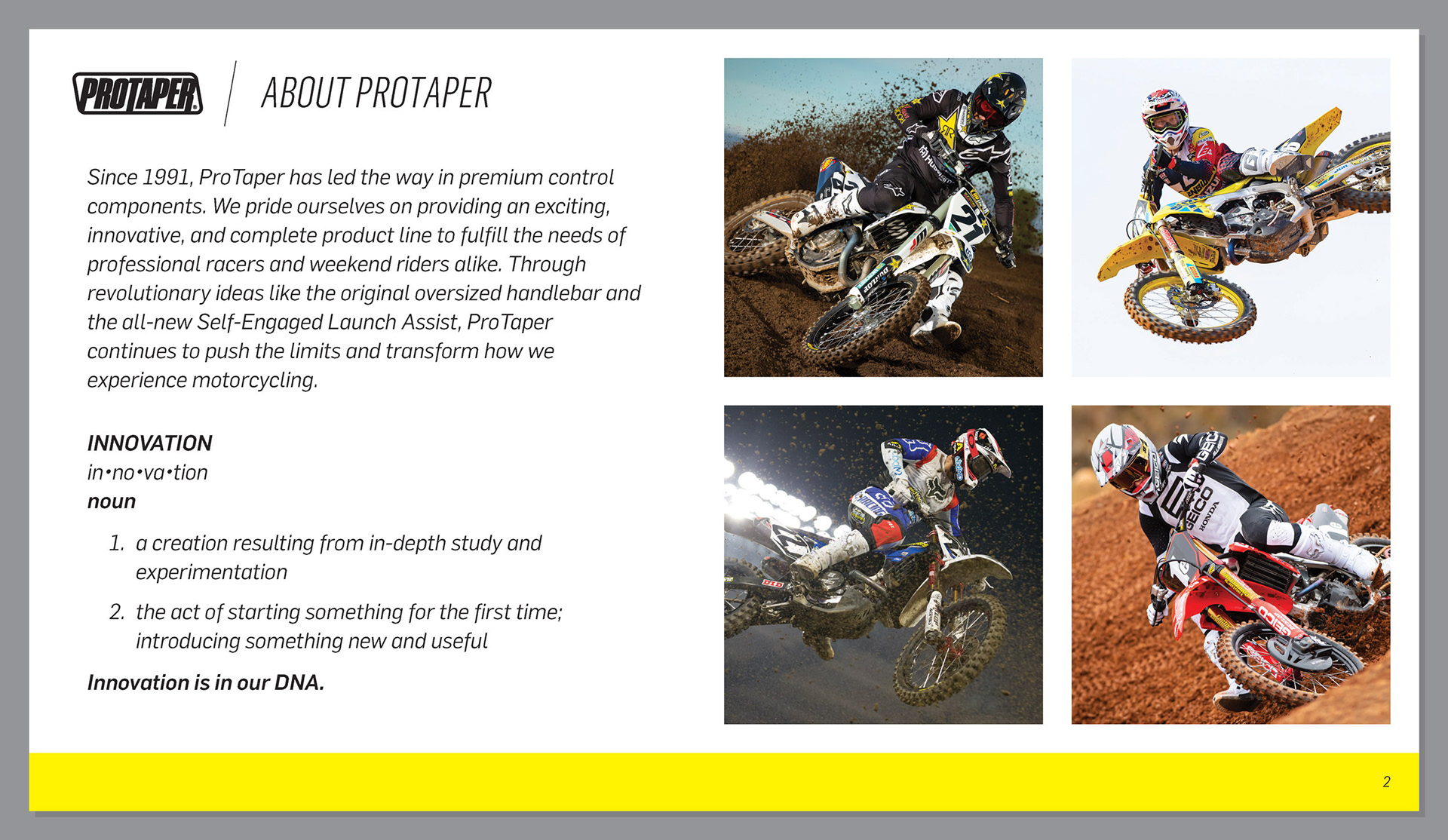
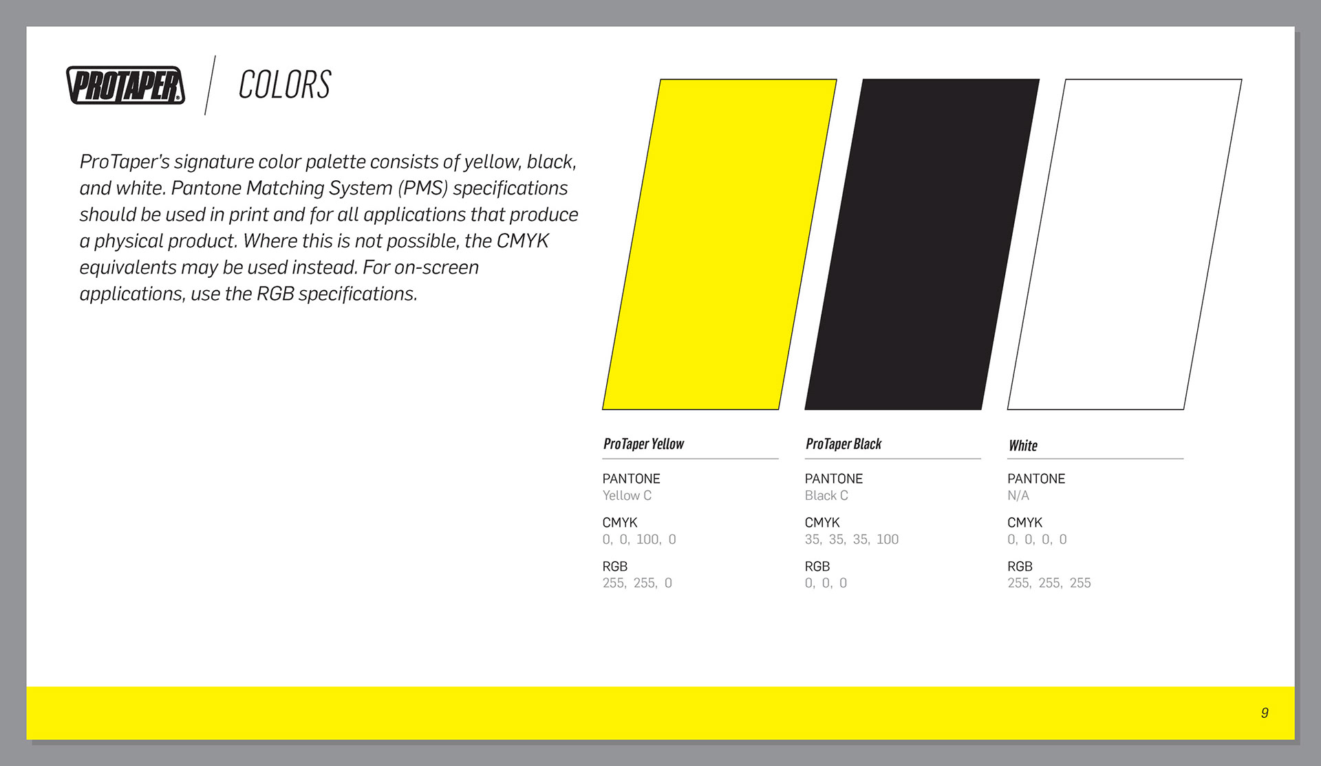
Colors are specified in PMS, CMYK, and RGB so they stay consistent across print, digital, and product applications.
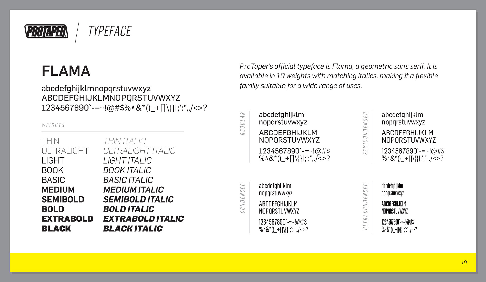
The brand typeface is Flama, a geometric sans serif. I documented the full family with type specimens.
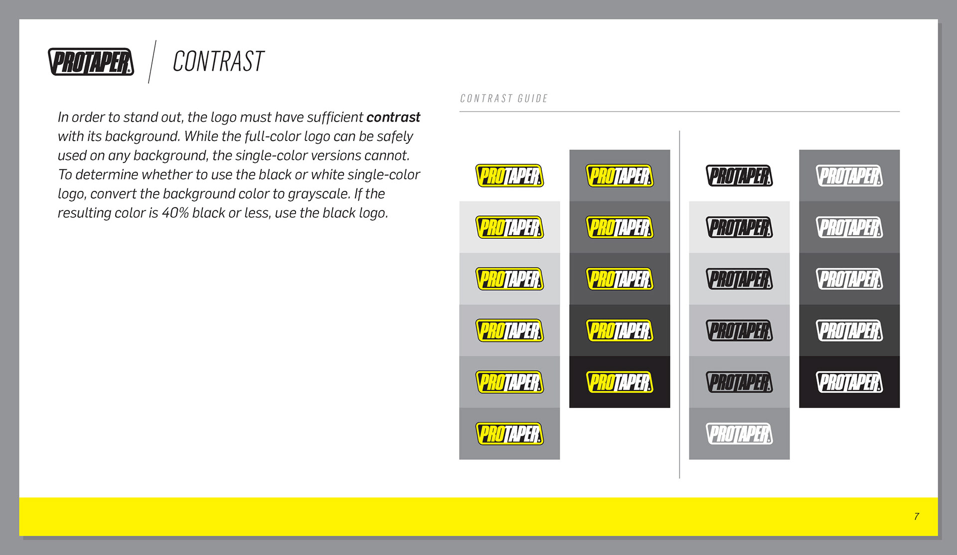
I created black and white single-color versions of the logo for applications where full color was not possible, or where yellow clashes with the surrounding design, along with a rule for choosing between them: if the background converts to 40% black or less in greyscale, the logo is rendered in black.
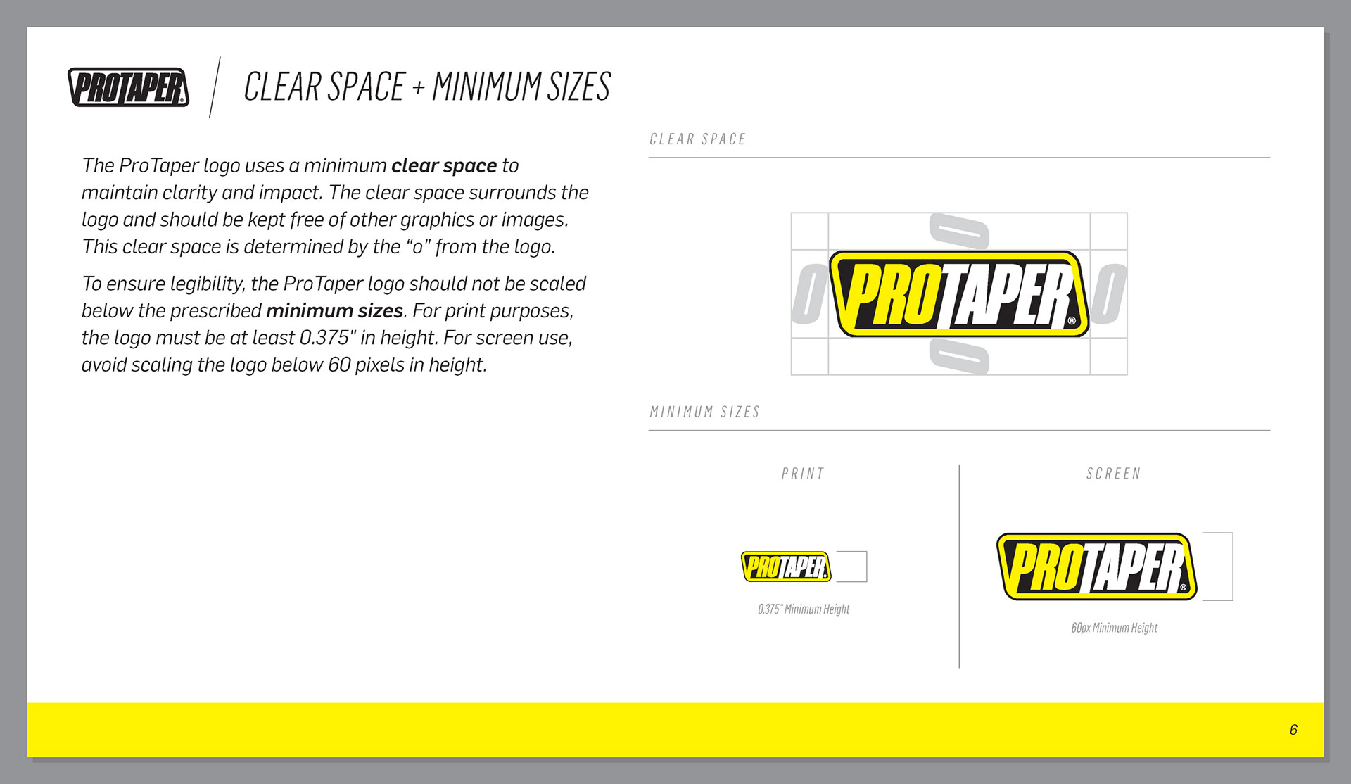
I set clear space and minimum sizes for the logo. Clear space is measured using the "o" from the mark and keeps other graphics and images from crowding it. Minimum sizes are specified separately for print and screen so the logo stays legible at small scale.
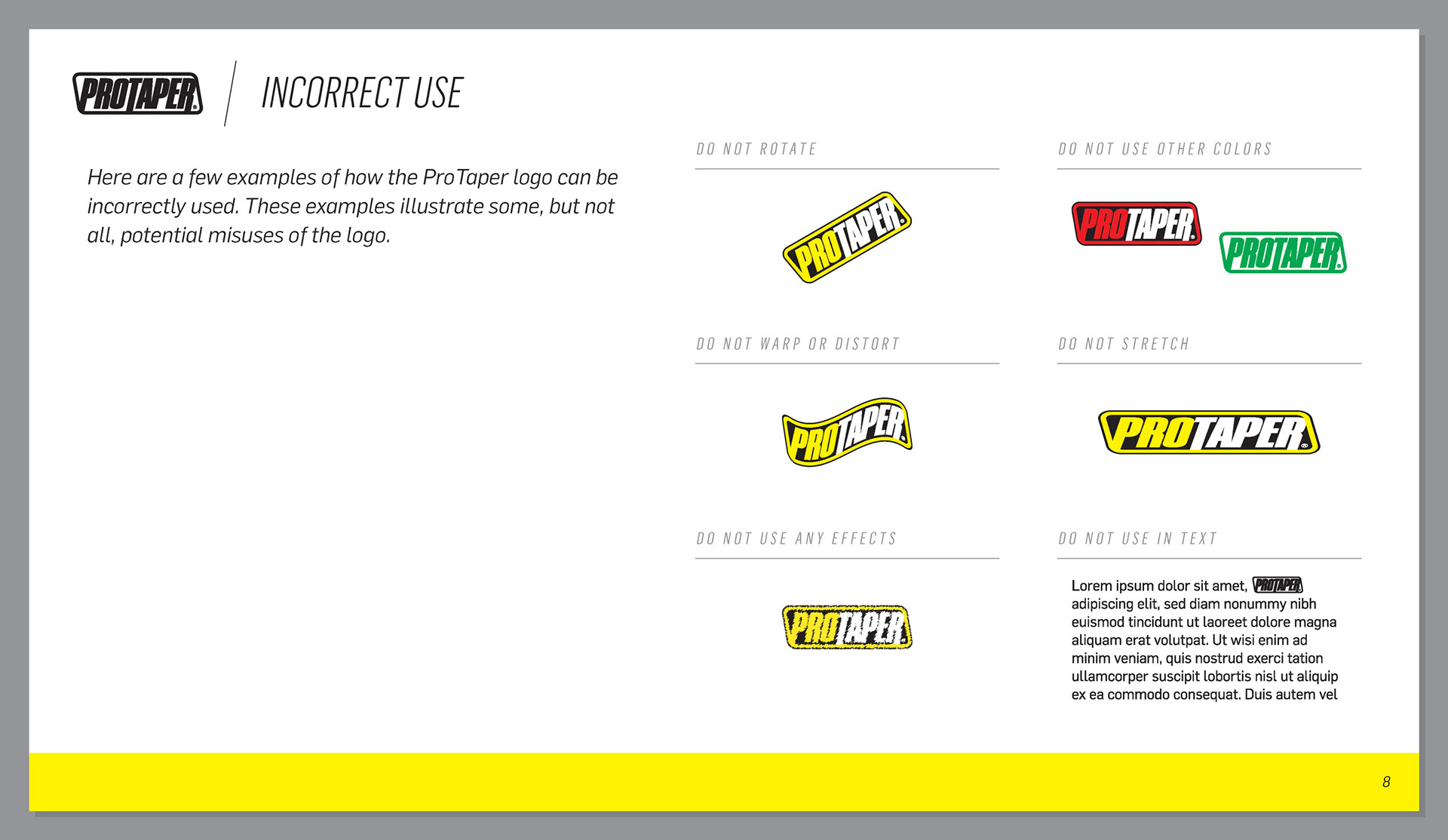
I also documented incorrect logo use, covering rotation, distortion, stretching, effects, unapproved colors, and setting the logo inside body copy.
I documented logo placement for race team jerseys and race bikes, specifying position, minimum size, and color. Teams build around their own colors and sponsors, so jerseys offer three approved placements rather than one fixed spot, letting each team fit the logo into their layout while keeping it somewhere predictable.
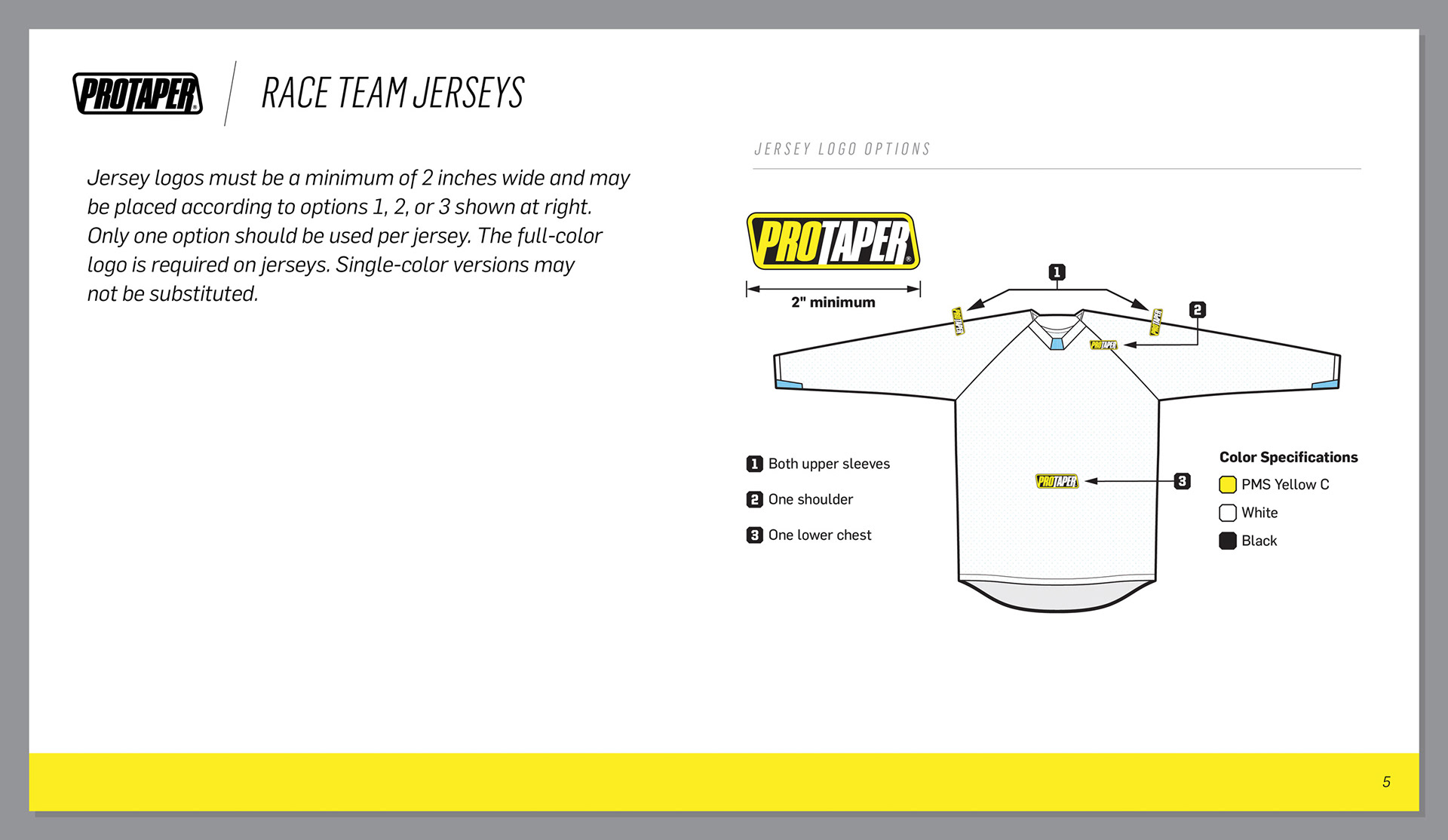
The style guide reduced logo misuse across the race program. Teams had been placing the logo in the wrong areas on their bikes, rendering it too large or too small, and using unapproved color combinations. One team had been printing the logo in white with a black backdrop on their white pit shirts. The guidelines showed that in cases like this, the logo should be rendered in black with no backdrop other than the garment itself.
ProTaper Sport
ProTaper Sport is a sub-brand created to reach customers for whom price is the most important factor, offering value-priced control components without giving up quality. I was tasked with designing the identity.

One of the requirements for the ProTaper Sport logo was that it incorporated the original ProTaper logo. The established ProTaper name and logo gave customers confidence in the new sub-brand.
I moved ProTaper Sport's colors to silver, black, and white to separate it from the mainline brand. The neutral palette makes the logo look more at home on a variety of different motorcycle colors.
I designed a secondary lockup in a shorter, wider frame for applications the primary mark did not suit. It became the version used on handlebar pads, where it fills the width of the pad.
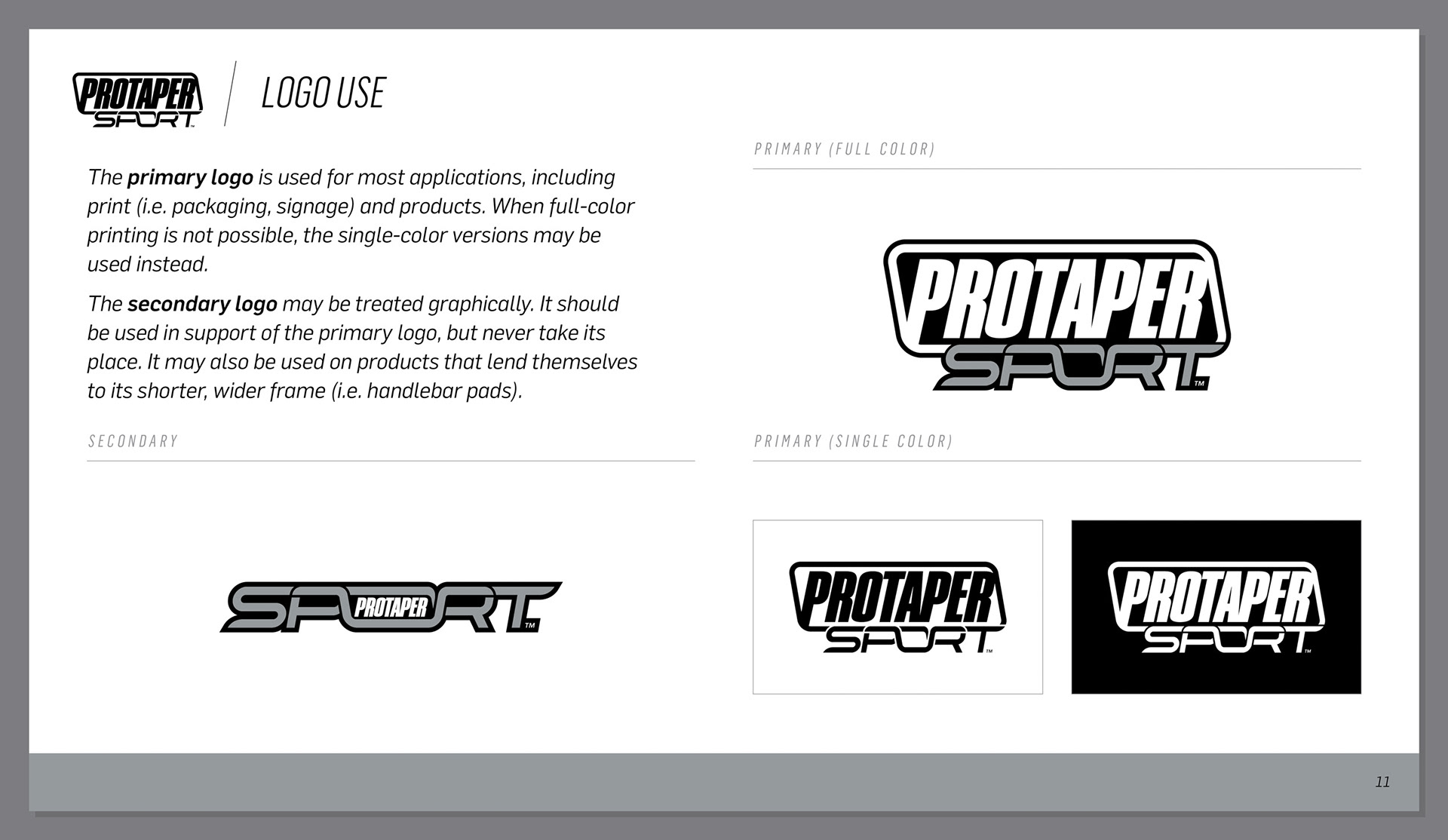
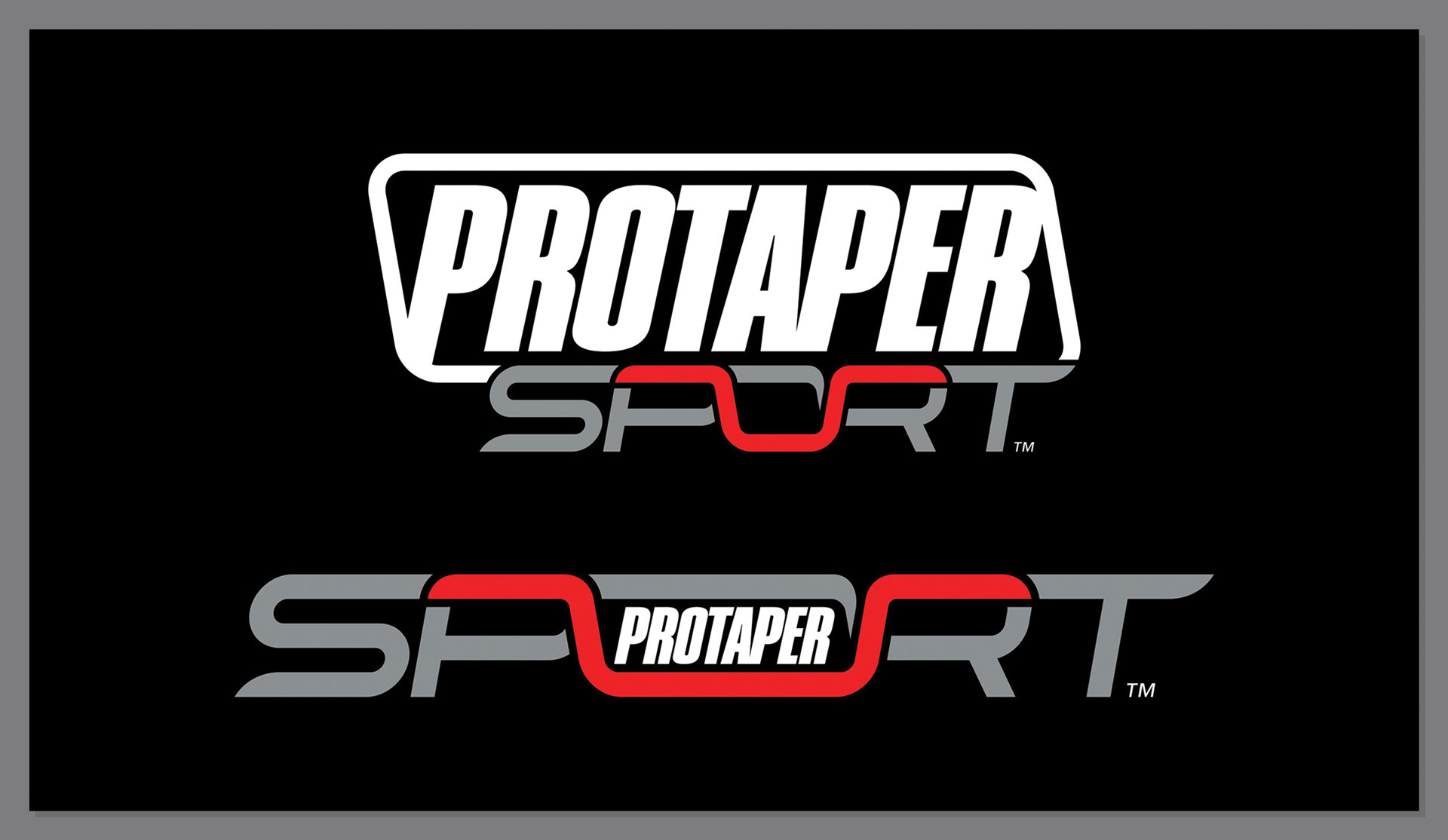
A handlebar profile is worked into the word SPORT, running through the P and the R and forming the bottom of the O. It appears in both lockups but reads most clearly in the secondary logo. ProTaper built its name on handlebars, so the shape ties the sub-brand back to what the company is best known for.
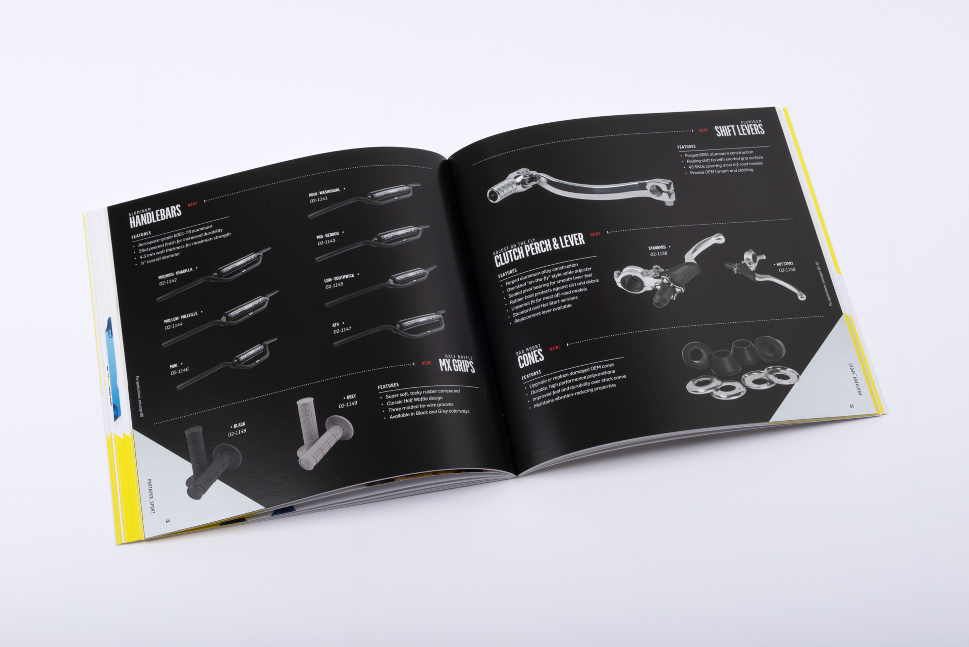
ProTaper Sport had its own section in the brand catalog. The layout and colors shift to signal a separate offering while staying inside the ProTaper book.
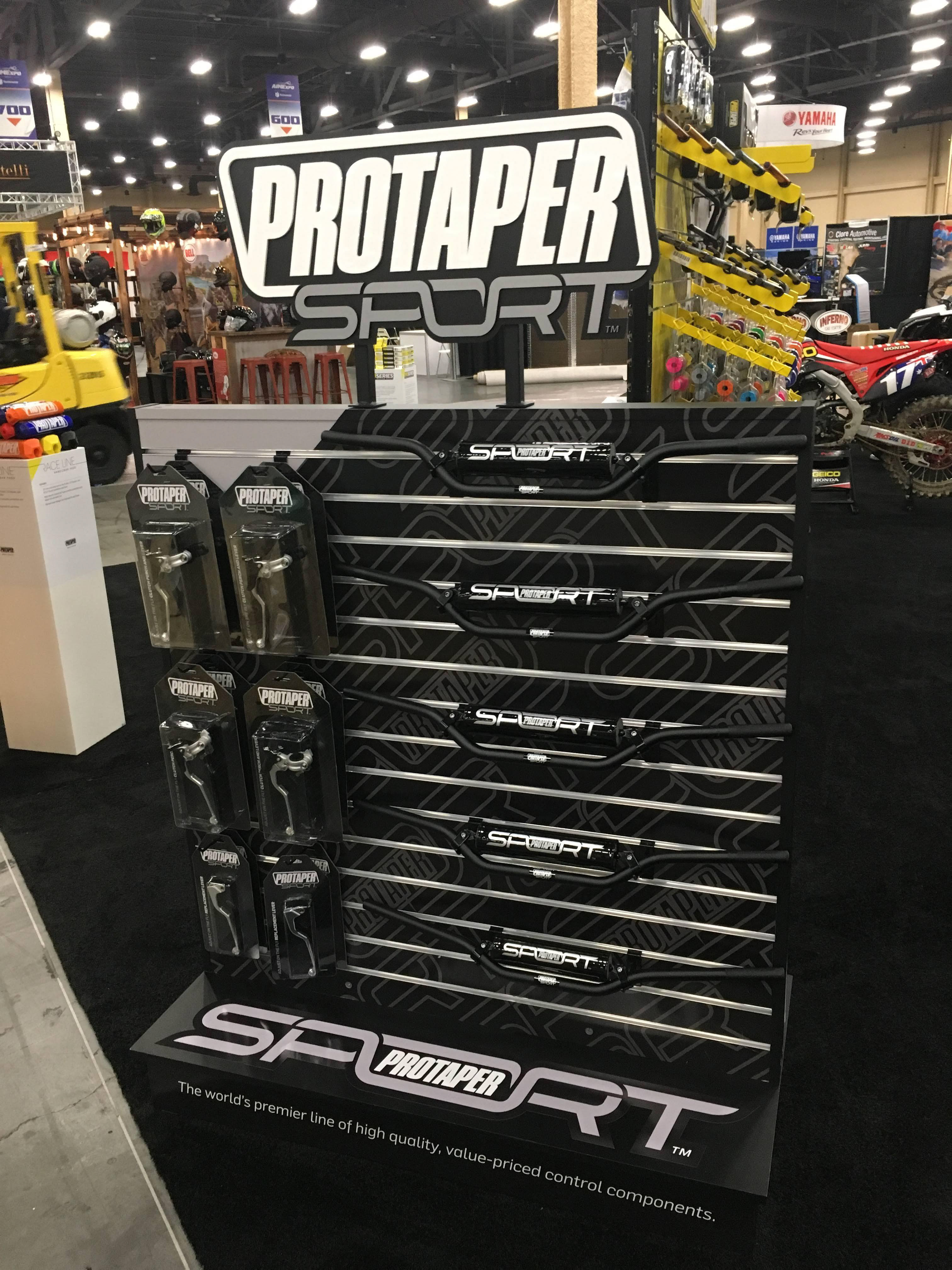
I designed the sales tools for the line, including a trade show display with a three-dimensional sign of the logo.
Dealers could merchandise ProTaper Sport alongside the mainline products, and the ProTaper logo within the identity made the line easier to sell. Dealer adoption was strong, and the line gradually expanded to include more products and a wider range of fitments for different motorcycles.